Why Japanese UI Text Breaks Your Layout, and How Localisation Teams Fix It
Designing a digital product for Japanese users involves more than translating English interface text. Japanese characters, sentence structure, buttons, menus, error messages, and navigation labels can affect the way a user interface looks and works.
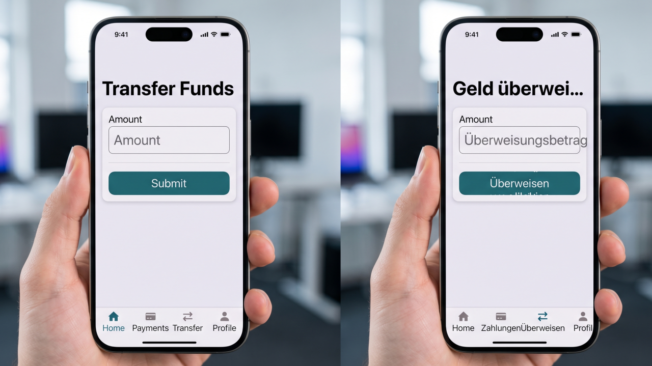
An English interface might have enough space for a short button label. The Japanese version might require a different amount of space or a different wording structure. If the design team translates content after completing the interface, text might overflow, wrap badly, or create alignment problems.
A strong localization process considers language and interface design together. Professional japanese translation services help teams prepare Japanese UI content while keeping the interface clear and functional.
Understand the Difference Between Translation and Localization
Translation changes written content from one language to another. Localization prepares the complete product for a specific market.
For a Japanese interface, localization might involve:
UI translation
Date formats
Number formats
Currency displays
Navigation labels
Error messages
Form fields
Help content
Product descriptions
User instructions
The goal is to make the interface feel natural to Japanese users while preserving the original product functions.
Review the Interface Before Translation
The translation team should receive access to the interface or screenshots before starting.
A list of isolated English strings does not always provide enough context.
For example, the word “Save” might refer to saving a file, storing a payment method, or protecting a setting. The Japanese translation could differ depending on the function.
Context helps the translator choose appropriate wording.
Check Button Length
Buttons have limited space.
English buttons often use short labels such as:
Save
Cancel
Continue
Submit
Next
Japanese translations might require different character lengths.
The design should allow enough room for Japanese text without forcing users to read compressed or overlapping labels.
Developers should test translated buttons inside the actual interface before release.
Review Navigation Menus
Navigation labels need to remain clear and consistent.
A website might contain sections such as:
Products
Services
Account
Settings
Support
Orders
Billing
The Japanese wording should match the function of each section.
Using inconsistent terminology between menus and page headings might confuse users.
A terminology guide helps the translation team use approved Japanese terms throughout the product.
Prepare for Text Expansion
Localization teams should expect differences in text length.
The translated version might occupy more or less space than the English source.
Designers should therefore avoid fixed text containers where possible.
Flexible layouts help prevent:
Text clipping
Broken buttons
Overlapping labels
Unexpected line breaks
Misaligned menus
Developers should test different screen sizes after Japanese content is added.
Test Error Messages
Error messages need special attention.
Users need to understand what went wrong and what action to take next.
A useful Japanese error message should clearly explain:
The problem
Why the problem occurred when appropriate
The next step
Any required action
Avoid translating technical English wording without considering the user.
An error message written for developers might not work for customers.
Review Form Labels
Forms often contain many short interface strings.
These include:
Name
Address
Phone number
Password
Postal code
Country
Payment details
Japanese users might expect certain information to appear in a different order or format.
The localization team should review the complete form rather than translating each label separately.
Consider Japanese Address Formats
Address fields deserve particular attention.
Japanese addresses follow a different structure from many English language address systems.
A localized form might need different field arrangements or instructions.
The development team should review the form design with Japanese users in mind.
Translation alone does not resolve every localization issue.
Review Date and Time Displays
Dates and times also need localization.
A product might display dates using an English format. Japanese users might expect a different presentation.
Teams should review:
Date order
Year display
Month display
Day display
Time format
Weekday names
Timezone information
These details should remain consistent across the product.
Handle Numbers and Currency Carefully
Financial interfaces require accurate presentation.
Prices, invoices, subscriptions, and payment screens might need Japanese yen formatting.
The localization process should verify:
Currency symbols
Decimal separators
Thousands separators
Price labels
Tax information
Payment amounts
The translation team should never change numerical values without approval.
Review Help and Tooltips
Short interface elements often contain important instructions.
Tooltips, help messages, onboarding screens, and small information panels should be translated with the surrounding interface in mind.
A short phrase might need different wording depending on the location and purpose.
Context remains important even for small strings.
Use Consistent Terminology
Consistency is one of the most important parts of UI localization.
If a product uses one Japanese term for “account” on one screen and another term on a different screen, users might think the two terms describe different features.
Create a terminology guide before translation begins.
Include:
Feature names
Menu labels
Button terms
Technical terms
Product names
Account terms
Support terminology
Approved Japanese translations
This guide should be updated as the product changes.
Keep Brand Names Consistent
Brand and product names need clear rules.
Some names should remain in English. Others might use Japanese characters or approved localized versions.
The company should decide how each name appears before the translation begins.
The same format should be used across the interface, website, help center, and marketing material.
Review Japanese Typography
Japanese text requires appropriate font support.
The development team should confirm that the selected fonts display Japanese characters correctly.
Review:
Character readability
Font size
Line height
Spacing
Weight
Alignment
Fallback fonts
A font problem might affect the interface even when the translation itself is accurate.
Test Mobile Interfaces
Mobile screens have limited space.
Japanese UI text should be tested on different screen sizes.
Check:
Buttons
Navigation
Popups
Forms
Notifications
Menus
Headings
Long error messages
A layout that works on desktop might break on mobile.
Test Different Content Lengths
Developers should test the interface with short and long Japanese strings.
This helps identify components with fixed dimensions.
Testing should include:
Short labels
Long descriptions
Multiple line messages
Long product names
Error messages
User generated content
This provides a better picture of how the interface behaves in real use.
Review User Generated Content
Some products allow customers to create content.
Examples include:
Profiles
Comments
Product names
Messages
Reviews
Posts
The interface should handle Japanese user generated content properly.
Character encoding and text display should work across the complete product.
Check Search Fields
Search functionality also needs localization.
Users might search using Japanese characters, mixed Japanese and English text, numbers, or product names.
The interface should support the expected character types.
Search instructions and filters should also use clear Japanese wording.
Review Notifications
Notifications often contain short messages with limited display space.
Examples include:
Payment confirmations
Order updates
Security alerts
Account messages
System notifications
The wording should be concise and clear.
Notifications should also remain readable on mobile devices.
Test Accessibility
Japanese localization should support accessibility.
Review:
Text size
Contrast
Screen reader behavior
Keyboard navigation
Form labels
Error messages
Focus indicators
Alternative text
Japanese text needs to remain understandable when users access the interface through assistive technologies.
Review the Complete User Journey
Testing individual screens is useful, but the complete user journey also needs review.
For example, a shopping platform might test:
Homepage
Product search
Product page
Cart
Checkout
Payment
Order confirmation
Support
Terminology should remain consistent from beginning to end.
A customer should not encounter different Japanese terms for the same feature during the same process.
Use Native Japanese Review
A native Japanese reviewer can identify problems that basic translation checks might miss.
The reviewer should examine the interface as a user rather than only reading translated strings.
They should look for:
Awkward wording
Unnatural expressions
Incorrect terminology
Missing context
Layout problems
Inconsistent labels
Confusing instructions
This type of review improves the final user experience.
Build Localization Into Development
Localization works better when developers consider it from the beginning.
The interface should support translated text without requiring major redesign.
Developers should avoid hardcoding text into graphics or creating fixed containers that only work with English wording.
A flexible structure makes future localization easier.
Use Translation Memory
Products often reuse the same interface terms.
Translation memory helps store approved translations and reuse them across future updates.
This improves consistency and reduces repeated translation work.
It also helps teams maintain the same terminology across different product versions.
Review Updates Before Release
Every new product update might introduce new text.
The localization team should receive new strings before release.
A practical workflow is:
Identify new content
Translate
Review
Add terminology
Integrate
Test
Approve
Release
This prevents untranslated English text from appearing in the Japanese interface.
Why Professional Translation Support Matters
UI localization requires coordination between translators, designers, developers, product managers, and reviewers.
Professional japanese translation services help teams translate interface content while considering terminology, context, readability, and the target audience.
The strongest workflow begins before the interface is finalized. Translation teams should receive context, screenshots, product information, terminology guides, and design requirements.
Japanese localization also requires technical testing. The translated content needs to appear correctly inside buttons, menus, forms, notifications, and other interface elements.
A Japanese UI should feel natural, readable, and consistent. Translation quality matters, but layout and usability matter too.
Teams that plan localization early reduce the risk of expensive redesign work. Flexible layouts, clear terminology, native review, and proper testing help ensure the Japanese version works as intended.
Professional japanese translation services give product teams structured support for translating and reviewing UI content. When translation and development teams work together, Japanese users receive a clearer experience across websites, applications, and digital products.